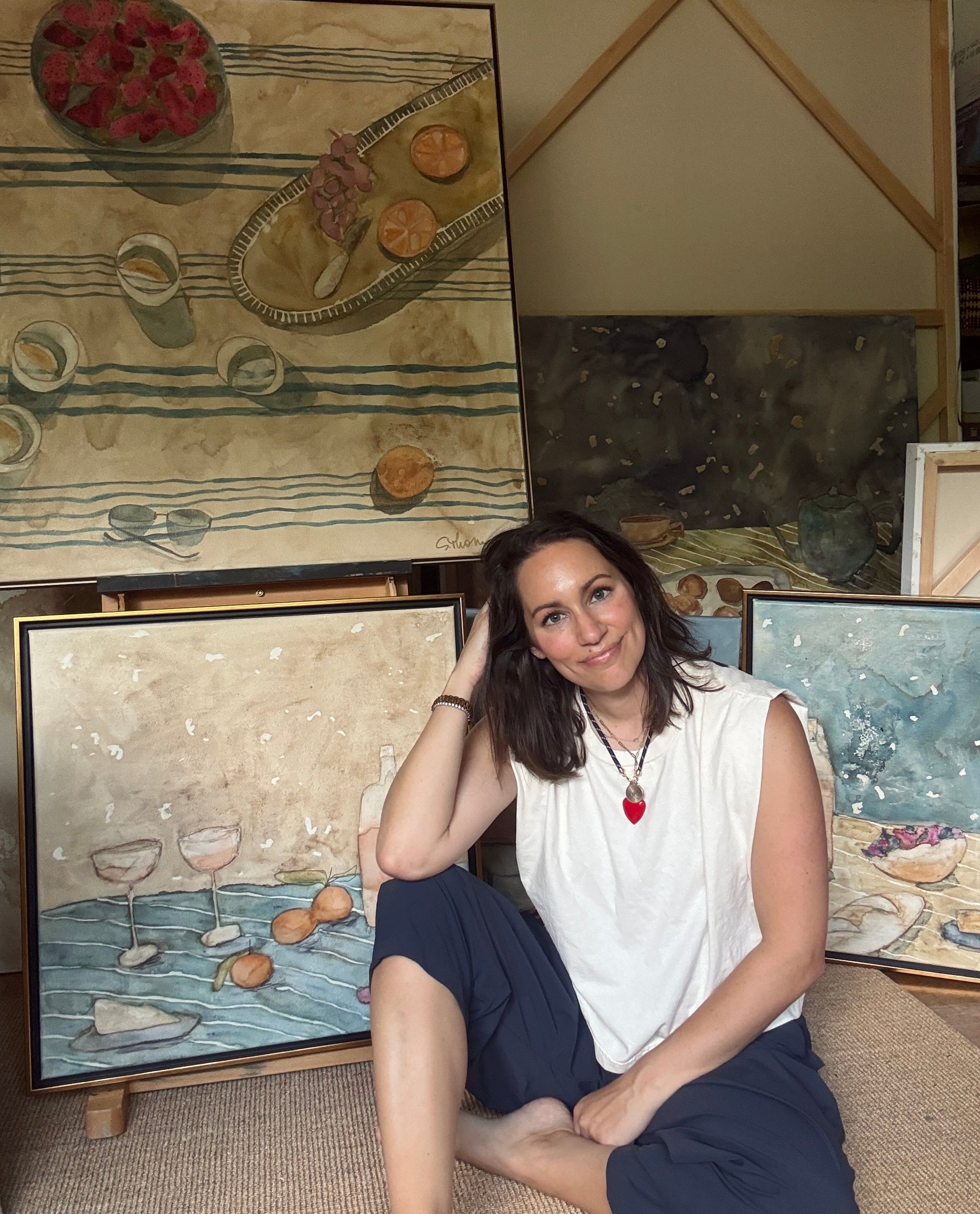
Do you ever wish for your own Whitney Stoddard gallery wall in your home? Do you wish for the perfect custom frame and for the artist to select each piece, chose the frame, and hang them for you? Well, you just so happen to be in luck...When photographer Anne Rhett stopped by Whitney's studio to photograph her paintings for next weeks release they got to talking about the strategy behind, planning, hanging, and framing a gallery wall. We were beyond thrilled when Whitney shared her insights from this seemingly innocuous convo with us because we knew we wanted to share all of her tips and tricks with y'all. So straight from the artist's mouth, we've included all of Whitney's thoughts below. Read the full post for some serious inspiration in the days leading up to Whitney's release because next week we are releasing 8 original Whitney Stoddard paintings featuring all of these pieces here custom-framed along with a step by step how to hang - snag one of these pieces OR all of them if you’re ready for your Whitney Stoddard gallery wall!

First step first...I chose the pieces that I wanted to have framed and be included. I knew I wanted at least one big lady, several medium-sized pieces, and one or two smaller sizes. Knowing the space I would be hanging this gallery, I felt that 8 to 10 framed pieces would fit comfortably together (Side note: I prepared 12 pieces for this gallery, knowing that I would likely only use 8 or 9. This gave me some flexibility when it came time for the final arrangement, as I could switch out pieces that may have looked perfect together in my mind's eye, but didn't end up looking quite right when it came time to hang).
Next step was determining different styles of pieces. I always love to have a solid mixture of black and white, lighter and darker saturations, abstract busts, figure studies, and in this particular instance, I threw in a little custom framed tea-stained collage into the mix. I love the juxtaposition between styles, as well as coloring.
Then onto the framing... I truly believe that framing is the final step of creation when it comes to artwork. Having a gorgeous piece of art framed well can truly complete and transform an entire space. Each piece in this collection is custom framed and finished with museum glass which further protects the artwork from fading or glaring.

Having already chosen the pieces I was going to use for this gallery collection, I wanted to create a very eclectic arrangement, which included different matting styles, mixed metals, high gloss lacquers & brushed finishes. I have long since had a love affair with burlwood, and completed the largest piece in this collection, {Burkie}, in a high gloss lacquered burl. I absolutely love the way she turned out! Then onto a sister-pair of pieces, which I thought should be the only two pieces framed identically. These two ladies were created as a pair, and I love the way the speckled gold finishes their entire look. I felt like the black and white abstract bust in this collection needed a clean and simple, yet classic look- so she's framed in a very sleek gold with just a hint of a bamboo imprint. The larger of two black and white figure studies are framed in a very deep brass with ornate detail in each corner. I think this frame perfectly paired with the simplicity of the figure, giving a really elegant finish. The smaller, more simplistic figure rendering is finished in very classic and timeless gold with the perfect saturation: simple and regal. I thought the abstract, and more modern abnormality, in the gallery deserved a very fun framing choice, which is why I chose the thick & ornate art-deco frame. This is a bit of a play on the thickness and saturation of both the piece and the frame itself. I think this works perfectly when in a stand-alone setting, as well as when in a curated collection. The final, and smallest piece in this gallery is a very detailed tea-stained collage, finished in a beveled-edged burlwood. The color of the burlwood, in addition to the small beveled edge really gives this small collage a big presence.
Once each piece was framed and ready to hang, all it really took was a bit of patience. I love to measure the wall space I intend on using, then play around with each of the pieces on the floor before committing to anything. Most times I have a specific vision in my head for how I'd like to see the collection hung, which rarely ever ends up being the final result. In this specific instance, I thought I would create three distinct vertical columns and intersperse the sizes throughout; however, once I began to lay everything out on the floor, something just wasn't working. One thing I wanted to make sure to take into consideration was separating each of the black and white pieces so that they weren't all hung together, which I felt would look odd. After playing around with the arrangement a bit, I decided to tweak the columns and hang the pieces in the center off just a bit from one another, and not in a straight column. I think this added to the organic feeling, as well as creating a curated feel as opposed to a "cookie-cutter" arrangement. I always love hanging larger pieces above smaller pieces, which may seem a bit unnatural at first, but I think this gives a very unique top-heaviness when done well, creating intrigue on many different levels.