Amanda Louise Campbell is the talented interior designer and name behind Amanda Louise Interiors. Based out of Greenville, South Carolina, Amanda Louise’s philosophy is that a home is the place where our personalities should shine and our favorite things should live. She is exceptionally talented at curating and mapping a gallery wall. It takes a keen eye and a keener sense of spatial awareness (a trait that, unfortunately, I do not possess) to plan an execute a successful gallery wall. Lucky for us, and you!, Amanda Louise has kindly provided us with some tips and tricks to planning, mapping, and curating a gallery wall. From finding those WOW pieces to those that make you look twice Amanda Louise style is collected, comfortable, and refined. She’s an expert – trust us! Thank you, Amanda Louise, for providing us with some of your tricks of the trade as well as gathering Well + Wonder artwork in an example wall, we are so looking forward to putting your advice to practice! Read the full post below:
Amanda Louise: Gallery walls are one of my favorite ways to fill wall spaces and add personality to homes. These can be collections of pieces from travel, prints to fill your walls cost effectively, or basically any combo you can think of… but there are a few guidelines and loose rules that can help you get started if you’re starting from scratch.

1) Choose a loose theme: Abstracts and color studies can mix in with anything but they need to be balanced with some more literal pieces. To keep your wall from feeling random, there needs to be one tie that binds, whether in subject or color. You could choose different bird paintings, birds and flowers, architecture, all things yellow, and the list is limitless. I have a gallery wall at my house that features dog paintings that I’ve collected and I break them up with abstracts and color studies. For our Well & Wonder gallery wall, we chose flowers as our more literal theme and also kept things cohesive by choosing pieces within a similar color palette
2) Vary Shapes and Sizes: To add more interest and keep things from being all the same size, make sure you have a variation or sizes, shapes, and orientations. You don’t want all of the pieces to be horizontal or square and it’s always more impactful when one piece is twice the size of most of the smaller works.
3) Choose a variety ofmedias and textures: Gallery walls are also more interesting when there is a variety of medias used. Choose some watercolors that are mounted under glass, some canvases that have chunky layers of paint, some paintings on wood panel, some on thin canvas. It’s all about creating a variety to make the collection look curated.
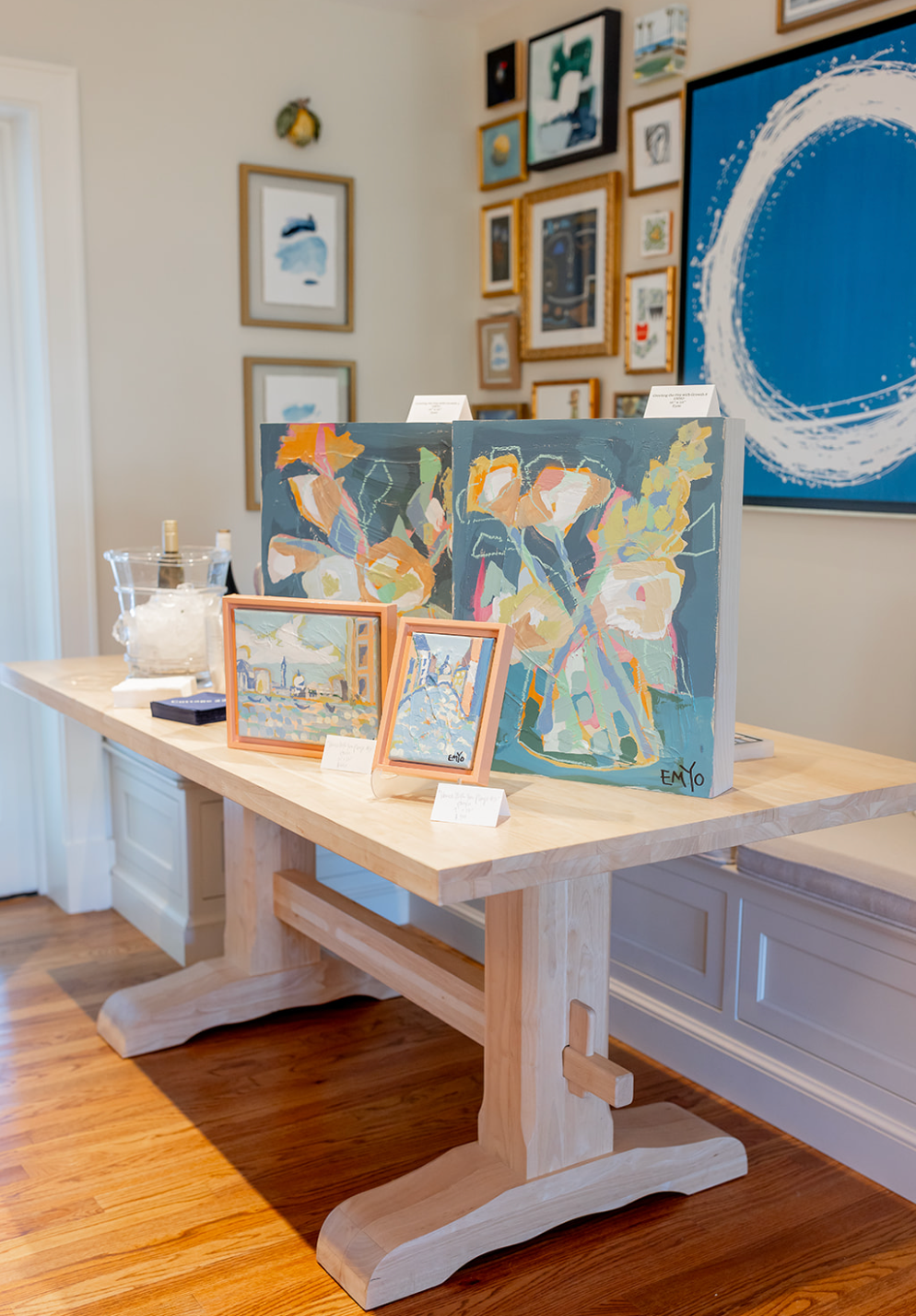
Luckily, Well + Wonder is a one stop shop for curating a thoughtful collection of pieces that reflect your style at a price point that fits budgets large and small. We have added just a few of our favorites to our ‘virtual gallery wall’ but there is a wealth of beautiful creations you could add to the collection and plenty of inspiration if you choose to take the leap and start fresh.

Photos by: Cameron Reynolds & Luke Cleland


